Tuesday, June 4, 2019

Map for the Hogan Family


Map for the Hogan Family. We began working with Katie and Kevin in 2009, when we designed the save the date for their 2010 wedding. Since then, between Katie and Kevin and their extended families, we have completed too many projects to post here. From a custom monogram to wedding invitations and day of the wedding materials to baby showers; wedding gift portraits (Father of the Bride parody) to anniversary portraits to baby portraits; banners to Christmas cards; moving announcements to retirement parties; birthdays to barbecues. We even created books for each of their children, year by year, chronicling the year's events and their growth in illustration. We are now at 11 books and counting! So a map seemed a logical next project, and we were happy to make such a special gift for a wonderful family.

Thursday, May 2, 2019

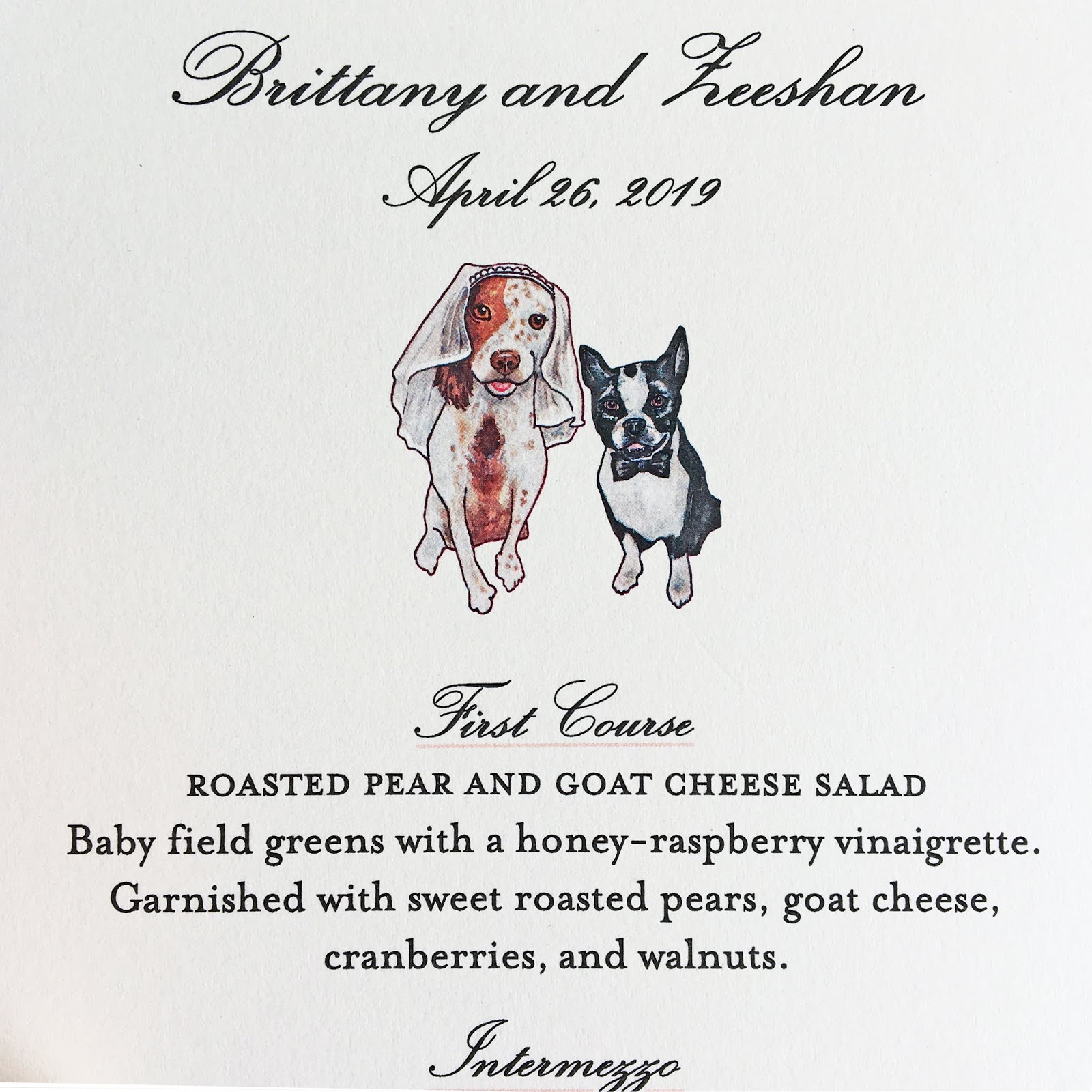
Timeless Invitations with a Touch of Pink


Brittany and Zeeshan's classic and timeless invitation suite with a touch of blush pink. Drink signs, seating cards and menus complement the invitations and also features the return of the couple's dogs from their save the date.

Tuesday, April 16, 2019

British Virgin Islands Adventure Map

The Amarante family commissioned a map of the British Virgin Islands to commemorate their 2016 "dream trip." The map routes their sailing trip and the highlights along the way.

Tuesday, March 26, 2019

Shimmery December Wedding Invitations


Winter shimmer and vintage ornate calligraphy flourishes are the centerpiece of Allison and Brian's December wedding invitations. 

Classic Logo Design

Logo for Restoration Max - City and Coastal Home Design. The company's focus is on vintage woodwork and architectural elements and is based in Manhattan and the Jersey Shore.

Saturday, February 16, 2019

Understated and Classic Neutrals


Jessica and Jason’s May 2018 wedding invitations This graceful suite came together using a palette of neutrals and gray-greens. Delicate details and a satin bow belly band made for an understated elegance. We used the Bay Head Yacht Club artwork from their save the dates on the reception cards. Jessica’s mother also had the art printed on a glass tray as a gift for the newlywedJessica and Jason’s wedding. This graceful suite came together using a palette of neutrals and gray-greens. Delicate details and a satin bow belly band made for an understated elegance. We used the Bay Head Yacht Club artwork from their save the dates on the reception cards. Jessica’s mother also had the art printed on a glass tray as a gift for the newlyweds. 

Friday, February 15, 2019

Vintage Candy Box Parody Invitation


What could be sweeter than this surprise 90th birthday invitation for “Muffie?” These tri-fold, vintage candy box parody invitations were printed on metallic gold card stock with a white reverse side. Perfect for a lifelong chocolate lover!

Monday, January 28, 2019

Timeless Black and Gold Marble

The natural beauty of marble creates an instant elegance in Lauren and Joseph’s wedding invitation. The use of bronze and black metallic papers and satin bow elevate the refinement and beauty of the design. Gold thermography on black is the finishing touch.

Sunday, January 27, 2019

Watercolor Floral Wreath and Handlettering


Noelle and Christopher’s wedding invitations feature original watercolor floral art and hand lettering. Printed on gorgeous Arturo cotton stock, the design is accented by a navy base layer. Kraft envelopes add to the natural look and feel of invitation suite. 

Sunday, January 20, 2019

Mansion at Natirar Elegance


We love adding wedding venue illustrations to our portfolio. The beautiful Mansion at Natirar in Peapack- Gladstone is an example of lovely,  historic New Jersey architecture. Built in 1910 as a private residence for an heiress, it has since been turned into a well-loved spot for elegant weddings.  The Mansion boasts amazing architectural details. Daniela and Erik chose to accentuate the charm of the building and grounds by using spots of gold foil and gray letterpress. A regal ruby color sets of the warmth of the foil. The interior architectural detail of a picture window overlooking the lush acreage was used for wine bottle labels. The bride's father made the wine, adding a personal touch.
Copper letterpress plates. 

Barnegat Lighthouse Views


Long Beach Island, NJ is a lovely place in the fall and a special place to get married. Near and far views of Barnegat Lighthouse inspired Michelle and Scott's wedding invitations. This is the view from their wedding venue, Sea Oaks Country Club. The invitations were printed in deep gold and burgundy thermography on crisp white cotton card stock.

Tuesday, January 15, 2019

Gold foil loveliness with a Touch of Pink


Gold foil letterpress is always a stunner, and when it shows off original art, it’s even more special. This handlettering was created for Lauren and Christian, and used first on their Save the Dates 


Illustrated Maps of 2018

Twenty-fifth Wedding Anniversary map.


Illustrated map wedding invitation and matching carnival seating cards.

Gift to the newlyweds from the groom's aunt.

First anniversary map for the Metzes.

Save the date for an Italian destination wedding.


Spring Lake, NJ map updated with ceremony and reception banners, plus icons representing the groom's home and a lifeguard chair to commemorate his time as a Belmar lifeguard. The RSVP card features illustrations of historic tiles from the Spring Lake boardwalk. Lisa and Ian's dog, Corra, made for a cute compass center, and their reception card featured the venue -  Essex and Sussex on Ocean Avenue in Spring Lake.


Monday, January 14, 2019

Fall Wedding at the Shore


Classic beach elements with an autumn color palette make this invitation suite stand out. Original watercolor sand dollar art and Adirondack chairs are highlighted with a mix of soft, off-white cotton and warm gray metallic papers. The envelope art is a nod to the boardwalk benches of Avon-by-the-Sea, NJ, the bride’s hometown.